Choose depth and finish together
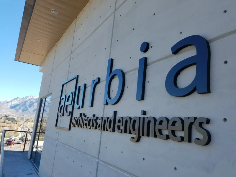
Flat-cut letters offer a crisp silhouette. Thicker or layered construction creates stronger edge detail and shadow. Acrylic, metal, and other fabricated materials have different visual and mounting characteristics. The best choice depends on the wall, the size of the logo, and whether the sign is viewed from across a room or up close. Compare finishes in the actual light rather than relying on a screen rendering.
Prepare the artwork for fabrication
Start with approved vector artwork and identify the minimum acceptable size. Fine strokes, small counters, and complex logo details may not translate directly into a physical object. Letter spacing also changes how a sign reads at scale. Review the production drawing for overall width, individual elements, finish, mounting pattern, and any approved simplifications before fabrication begins.
Let the wall inform the mounting plan
Drywall, masonry, glass, tile, and architectural panels require different attachment approaches. Tell us about drilling restrictions, access behind the surface, and future relocation plans. A carrier panel may solve a difficult background or mounting problem. Individual letters can preserve the architecture, but they require careful layout and may leave more individual attachment points when removed.
Separate interior identity from exterior exposure
An indoor reception sign and an exterior building sign should not be specified from appearance alone. Exterior work must consider weather exposure, secure attachment, local review, property criteria, and safe installation access. If illumination is part of the concept, confirm the electrical and licensed installation scope before setting the design or opening schedule.
Price the complete installed result
Overall size, letter count, depth, material, finish, layers, mounting, lighting if included, and access affect the quote. Send the vector logo, a dimensioned wall photo, site address, intended installation date, and any landlord criteria. Ask for alternatives with comparable finished dimensions so a material comparison is meaningful rather than a comparison of two different scopes.
MATERIALS & APPROACHES
Find the right fit.
Where it can work
- Reception logos
- Corporate identity walls
- Retail branding
- Hospitality interiors
- Exterior identity requests
A few useful answers.
Are dimensional letters the same as channel letters?+
No. Dimensional letters describe physical depth broadly. Channel letters are a fabricated letter construction often used for illuminated signs; that scope needs a separate review.
Can you match our brand color?+
Provide the official color specification and review the proposed finish or sample. Screen colors and printed proofs do not reproduce every paint or material finish exactly.
Can we use the same design indoors and outdoors?+
The visual identity can be consistent, but materials, mounting, exposure, and approval requirements may differ. Specify each installation environment separately.