
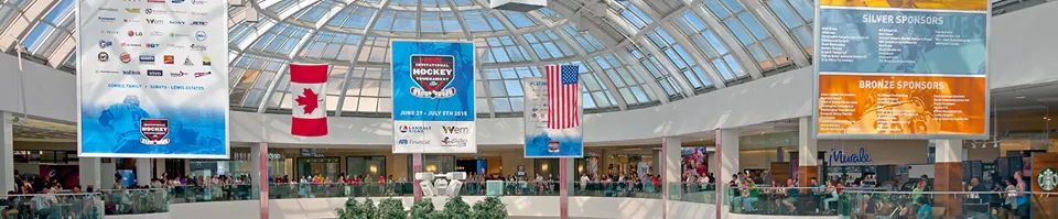
Design for a quick read
Use a short headline, a clear visual and only the supporting information people need. A banner viewed across a room should not be laid out like a flyer. Check the final dimensions and avoid putting critical text near edges or attachment areas.
Match finishing to the display
Describe whether the banner will hang on a wall, frame or another approved support. Material, hems, pockets and attachment details should follow that plan. Outdoor placement needs a review of exposure, support and any property permissions rather than an assumption that every banner can go anywhere.
MATERIALS & APPROACHES
Find the right fit.
Where it can work
- Openings and announcements
- Retail promotions
- Community and business events
A few useful answers.
How much text should a banner include?+
Keep the message proportionate to viewing distance and reading time. A headline and one action are often more useful than a long list.
Can the same artwork fit any size?+
Different proportions may require a new layout. Confirm the finished size before approving the design.
